FeatureTable
require(["esri/widgets/FeatureTable"], function(FeatureTable) { /* code goes here */ });esri/widgets/FeatureTableThis widget provides an interactive tabular view of each feature's attributes in a feature layer. In addition, it also works with standalone tables that are not associated with underlying geometries. When working with a large dataset, the table loads additional features as the user scrolls.
Known Limitations
- Number and date formatting is not yet supported but will be added in a future release.
- Viewing related records is currently not supported.
- Viewing attachments is currently not supported, although if a feature contains attachments, the total count per feature will display.
- Visible features from a map and having only these rows reflected in the table is currently not implemented but will be in an upcoming release. Although it is possible to select rows within the table and have their corresponding feature selected.
- Currently, if a map feature falls outside what is currently being viewed, it still displays within the feature table. Restricting the rows to match visible features is in current development plans.
- Dark themed CSS is currently not supported.
The following image displays the standalone FeatureTable widget without any associated map. 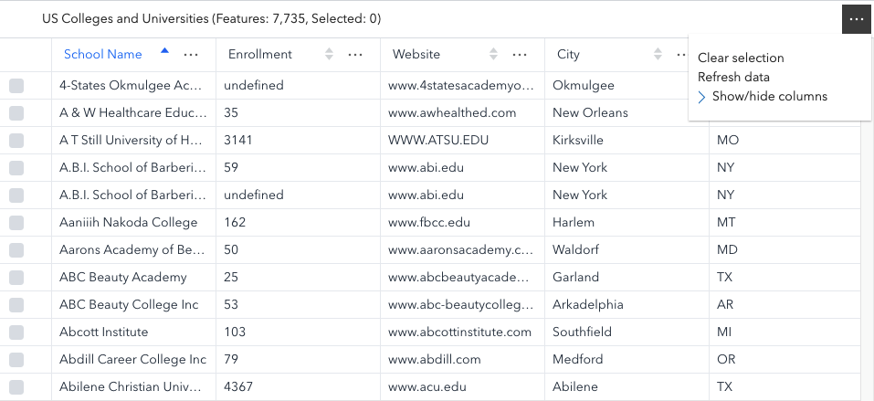
The following image displays the FeatureTable widget with an associated map. 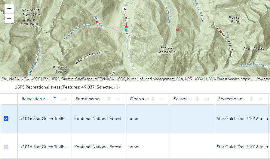
- See also:
Constructors
- new FeatureTable(properties)
- Parameter:properties Objectoptional
See the properties for a list of all the properties that may be passed into the constructor.
Example:// Typical usage for FeatureTable widget. This will recognize all fields in the layer if none are set. const featureTable = new FeatureTable({ view: view, // The view property must be set for the select/highlight to work layer: featureLayer, container: "tableDiv" });
Property Overview
| Name | Type | Summary | Class | |
|---|---|---|---|---|
| Boolean | Indicates whether to display the | more details | FeatureTable | |
| Boolean | When 'true', columns can be reordered by dragging a column's header. more details | more details | FeatureTable | |
| Collection<FieldColumn> | A collection of columns within the table. more details | more details | FeatureTable | |
| String|HTMLElement | The ID or node representing the DOM element containing the widget. more details | more details | Widget | |
| String | The name of the class. more details | more details | Accessor | |
| Boolean | Indicates whether editing is enabled on the data within the feature table. more details | more details | FeatureTable | |
| FieldColumnConfig[] | An array of individual field configuration objects. more details | more details | FeatureTable | |
| Boolean | Indicates whether to highlight the associated feature when a row is selected. more details | more details | FeatureTable | |
| String | The unique ID assigned to the widget when the widget is created. more details | more details | Widget | |
| String | The widget's default label. more details | more details | FeatureTable | |
| FeatureLayer | The associated FeatureLayer containing the fields and attributes to display within the widget. more details | more details | FeatureTable | |
| ButtonMenuConfig | Set this object to customize the feature table's menu content. more details | more details | FeatureTable | |
| MapView | A reference to the MapView. more details | more details | FeatureTable | |
| FeatureTableViewModel | The view model for this widget. more details | more details | FeatureTable | |
| VisibleElements | The visible elements that are displayed within the widget. more details | more details | FeatureTable |
Property Details
- attachmentsEnabled Boolean
Indicates whether to display the
Attachmentsfield in the table. This is only applicable if the feature layer supports attachments. Currently, this field only displays the count of attachments per feature.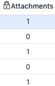
- Default Value:false
- columnReorderingEnabled BooleanSince: ArcGIS API for JavaScript 4.16
When 'true', columns can be reordered by dragging a column's header.
- Default Value:true
- columns Collection<FieldColumn>autocastSince: ArcGIS API for JavaScript 4.16
A collection of columns within the table.
The ID or node representing the DOM element containing the widget. This property can only be set once. The following examples are all valid use cases when working with widgets.
Examples:// Create the HTML div element programmatically at runtime and set to the widget's container const basemapGallery = new BasemapGallery({ view: view, container: document.createElement("div") }); // Add the widget to the top-right corner of the view view.ui.add(basemapGallery, { position: "top-right" });// Specify an already-defined HTML div element in the widget's container const basemapGallery = new BasemapGallery({ view: view, container: basemapGalleryDiv }); // Add the widget to the top-right corner of the view view.ui.add(basemapGallery, { position: "top-right" }); // HTML markup <body> <div id="viewDiv"></div> <div id="basemapGalleryDiv"></div> </body>// Specify the widget while adding to the view's UI const basemapGallery = new BasemapGallery({ view: view }); // Add the widget to the top-right corner of the view view.ui.add(basemapGallery, { position: "top-right" });
The name of the class. The declared class name is formatted as
esri.folder.className.
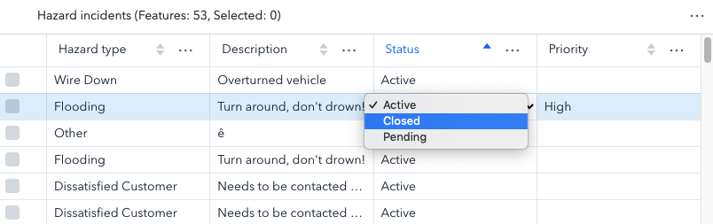
- editingEnabled BooleanSince: ArcGIS API for JavaScript 4.16
Indicates whether editing is enabled on the data within the feature table. Double-clicking in a cell will enable editing for that value.
Editing permissions can be broken down with the following levels of priority:
- Field - This is derived from the FeatureLayer. It takes what is set in the Field.editable property. This must always be
truefor editing to be enabled. This can be overriden using a field column configuration. - Config - The editable permissions on a field can be configured by setting the editable property of the FieldColumnConfig.
- FeatureTable - The editingEnabled property must be set on the table in order for any type of editing to be enabled.
For example, if table editing is disabled in the widget, i.e.
enableEditingis not set, it is still possible to enable editing for a specific column by setting the editable property. Vice versa is also true, if table editing is enabled, a field configuration can be used to disable editing for a specific column.Ultimately, if the service's field is not editable, it is not possible to override its permissions using one of the options above.
- Default Value:false
- See also:
[Sample - FeatureTable with editing enabled]
- Field - This is derived from the FeatureLayer. It takes what is set in the Field.editable property. This must always be
- fieldConfigs FieldColumnConfig[]
An array of individual field configuration objects. This is where you can specify what fields to display and how you wish to display them.
When not set, all fields except for
CreationDate,Creator,EditDate,Editor, andGlobalIDwill be included. Otherwise, it is up to the developer to set the right field(s) to override and display.- Default Value:null
- highlightOnRowSelectEnabled BooleanSince: ArcGIS API for JavaScript 4.16
Indicates whether to highlight the associated feature when a row is selected.
- Default Value:true
The unique ID assigned to the widget when the widget is created. If not set by the developer, it will default to the container ID, or if that is not present then it will be automatically generated.
- label String
The widget's default label.
- layer FeatureLayer
The associated FeatureLayer containing the fields and attributes to display within the widget. The table's pagination defaults to
50records at a time. If the layer contains less than 50 records, it will use whatever count it has. Note that 0 records do not apply.
- Since: ArcGIS API for JavaScript 4.16
Set this object to customize the feature table's menu content.
- view MapView
A reference to the MapView. This property must be set for the select/highlight in the map to work.
- viewModel FeatureTableViewModelautocast
The view model for this widget. This is a class that contains all the logic (properties and methods) that controls this widget's behavior. See the FeatureTableViewModel class to access all properties and methods on the widget.
- visibleElements VisibleElementsautocast
The visible elements that are displayed within the widget. This property provides the ability to turn individual elements of the widget's display on/off.
Example:featureTable.visibleElements = { header: true, menu: true, menuItems: { clearSelection: true, refreshData: false, toggleColumns: false }, selectionColumn: false }
Method Overview
| Name | Return Type | Summary | Class | |
|---|---|---|---|---|
| String | A utility method used for building the value for a widget's | more details | Widget | |
This clears any highlighted features. more details | more details | FeatureTable | ||
Clears the current selection within the table. more details | more details | FeatureTable | ||
Unselects the specified rows within the table. more details | more details | FeatureTable | ||
Destroys the widget instance. more details | more details | Widget | ||
| Boolean | Emits an event on the instance. more details | more details | Widget | |
Finds the specified column within the feature table. more details | more details | FeatureTable | ||
| Boolean | Indicates whether there is an event listener on the instance that matches the provided event name. more details | more details | Widget | |
Hides the specified column from the feature table. more details | more details | FeatureTable | ||
| Object | Registers an event handler on the instance. more details | more details | Widget | |
Widget teardown helper. more details | more details | Widget | ||
This method is primarily used by developers when implementing custom widgets. more details | more details | Widget | ||
Refreshes the table contents. more details | more details | FeatureTable | ||
| Object | This method is primarily used by developers when implementing custom widgets. more details | more details | Widget | |
Renders widget to the DOM immediately. more details | more details | Widget | ||
This method is primarily used by developers when implementing custom widgets. more details | more details | Widget | ||
Selects the specified rows within the table. more details | more details | FeatureTable | ||
Shows all the columns in the table. more details | more details | FeatureTable | ||
Shows the specified column within the feature table. more details | more details | FeatureTable | ||
Sorts the column. more details | more details | FeatureTable |
Method Details
A utility method used for building the value for a widget's
classproperty. This aids in simplifying CSS class setup.Parameter:repeatable The class names.
Returns:Type Description String The computed class name. Example:// .tsx syntax showing how to set CSS classes while rendering the widget render() { const dynamicIconClasses = { [CSS.myIcon]: this.showIcon, [CSS.greyIcon]: !this.showIcon }; return ( <div class={classes(CSS.root, CSS.mixin, dynamicIconClasses)} /> ); }
- clearHighlights()Since: ArcGIS API for JavaScript 4.16
This clears any highlighted features. Take note that the associated rows are not deselected.
- clearSelection()Since: ArcGIS API for JavaScript 4.16
Clears the current selection within the table.
- deselectRows(params)Since: ArcGIS API for JavaScript 4.16
Unselects the specified rows within the table.
Parameter:The selection parameters to deselect within the feature table.
- destroy()inherited
Destroys the widget instance.
Emits an event on the instance. This method should only be used when creating subclasses of this class.
Parameters:type StringThe name of the event.
event ObjectoptionalThe event payload.
Returns:Type Description Boolean trueif a listener was notified
- findColumn(fieldName)Since: ArcGIS API for JavaScript 4.16
Finds the specified column within the feature table.
Parameter:fieldName StringThe
fieldNameof the column to find.
Indicates whether there is an event listener on the instance that matches the provided event name.
Parameter:type StringThe name of the event.
Returns:Type Description Boolean Returns true if the class supports the input event.
- hideColumn(fieldName)Since: ArcGIS API for JavaScript 4.16
Hides the specified column from the feature table.
Parameter:fieldName StringThe
fieldNameof the column to hide.
Registers an event handler on the instance. Call this method to hook an event with a listener.
Parameters:A event type, or an array of event types, to listen for.
listener FunctionThe function to call when the event is fired.
Returns:Type Description Object Returns an event handler with a remove()method that can be called to stop listening for the event(s).Property Type Description remove Function When called, removes the listener from the event. Example:view.on("click", function(event){ // event is the event handle returned after the event fires. console.log(event.mapPoint); });
- own(handles)inherited
Widget teardown helper. Any handles added to it will be automatically removed when the widget is destroyed.
Parameter:handles WatchHandle|WatchHandle[]Handles marked for removal once the widget is destroyed.
- postInitialize()inherited
This method is primarily used by developers when implementing custom widgets. Executes after widget is ready for rendering.
- refresh()Since: ArcGIS API for JavaScript 4.16
Refreshes the table contents.
This method is primarily used by developers when implementing custom widgets. It must be implemented by subclasses for rendering.
Returns:Type Description Object The rendered virtual node.
- renderNow()inherited
Renders widget to the DOM immediately.
- scheduleRender()inherited
This method is primarily used by developers when implementing custom widgets. Schedules widget rendering. This method is useful for changes affecting the UI.
- selectRows(params)Since: ArcGIS API for JavaScript 4.16
Selects the specified rows within the table.
Parameter:The selection parameters to select within the feature table.
- showAllColumns()Since: ArcGIS API for JavaScript 4.16
Shows all the columns in the table.
- showColumn(fieldName)Since: ArcGIS API for JavaScript 4.16
Shows the specified column within the feature table.
Parameter:fieldName StringThe
fieldNameof the column to show.
- sortColumn(path, direction)Since: ArcGIS API for JavaScript 4.16
Sorts the column.
- Possible Values
Value Description asc Sorts the column in ascending order. desc Sorts the column in descending order. Parameters:path StringThe specified field name to sort.
direction StringThe direction to sort.
Possible Values:"asc"|"desc"
Type Definitions
- ButtonMenuConfig
The configurable options to customize either the feature table or column menu via the menuConfig property.
- Properties:
- optionalcontainer HTMLElement
The DOM Element containing the menu.
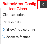
optionaliconClass BooleanAdds a CSS class to the menu button's DOM node.
 optionalitems ButtonMenuItem[]
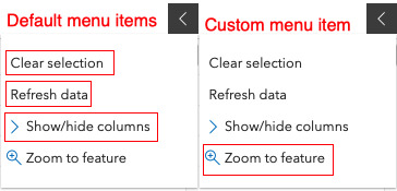
An array of ButtonMenuItems. The following image shows the default menu with two additional items.
 optionalopen Boolean
Indicates if the menu content is visible. Default is
false.optionalviewModel ButtonMenuViewModelThe associated viewModel for the ButtonMenu.
- See also:
- ButtonMenuItemConfig
The configurable options to customize either the feature table or column menu via the menuConfig item property.
- Properties:
- optionalautoCloseMenu Boolean
Indicates whether to automatically close the menu's item.
optionalclickFunction ButtonMenuItemClickFunctionA function that executes on the ButtonMenuItem's
clickevent.optionaliconClass StringAdds a CSS class to the menu button's DOM node.
optionalitems ButtonMenuItem[]An array of individual menu items.
optionallabel StringThe label of the menu item. This can be used in conjunction with the iconClass property.
optionalopen BooleanIndicates if the menu content is visible.
optionalselectionEnabled BooleanIndicates whether a toggled state should be applied to individual menu items.
optionalselected BooleanIndicates whether the menu item is selected.
- See also:
- VisibleElements
The visible elements that are displayed within the widget. This provides the ability to turn individual elements of the widget's display on/off.
- Properties:
- optionalheader Boolean
Indicates whether to display the feature table's header information. Default value is
true.optionalmenu BooleanIndicates whether to display the feature table's menu.Default value is
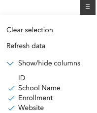
true.optionalselectionColumn BooleanIndicates whether to display the selection column in the table. Each row has a checkbox that selects its corresponding feature.
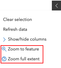
optionalmenuItems ObjectThe menu items within the feature table menu. This image shows the individual items within the widget's menu.
- Specification:
- optionalclearSelection Boolean
Indicates whether to display the
Clear selectionmenu item. Default value istrue.optionalrefreshData BooleanIndicates whether to display the
Refresh datamenu item. Default value istrue.optionaltoggleColumns toggleColumsIndicates whether to enable toggling column visibility within the menu. Default value is
true.
Event Overview
| Name | Type | Summary | Class | |
|---|---|---|---|---|
{added: Object[],removed: Object[],} | Fires when a row selection is added and/or removed within the FeatureTable. more details | more details | FeatureTable |
Event Details
- selection-change
Fires when a row selection is added and/or removed within the FeatureTable.
- Properties:
An array of objects containing row (feature) data added to the table selection.
- Specification:
- feature Graphic
The associated row (feature) added to the feature table selection.
attachments AttachmentInfo[]If applicable, an array of AttachmentInfo associated with the row (feature) added to the feature table selection.
(Currently not implemented). If applicable, an array of related features associated with the row (feature) added to the feature table selection.
An array of objects containing row (feature) data removed in the table selection.
- Specification:
- feature Graphic
The associated row (feature) removed from the feature table selection.
attachments AttachmentInfo[]If applicable, an array of AttachmentInfo associated with the row (feature) removed from the feature table selection.
(Currently not implemented). If applicable, an array of related features associated with the row (feature) removed from the feature table selection.
- See also:
Example:// This function will fire each time a row (feature) is either added // or removed from the feature table's selection featureTable.on("selection-change", function(event){ const addedRows = event.added; // An array of rows (features) added to the selection const removedRows = event.removed; // An array of rows (features) removed from the selection });