Attachments
require(["esri/widgets/Attachments"], function(Attachments) { /* code goes here */ });esri/widgets/AttachmentsThis widget allows users to view and edit attachments associated with a feature and is considered a standalone experience that can be utilized in widgets such Popup and Editor. When viewing attachments, the attachment's thumbnail, file format, and size are displayed. The Popup widget uses this widget's functionality to display attachments. Whereas the Editor widget has the functionality to edit attachments automatically configured within it.
If the associated feature layer(s) contains an attachment capability, the widget will recognize it as such. And based on the functionality needed, will display the attachment for viewing or editing.
If needing to edit attachments, the feature layer must first be enabled for editing. The ability to create, update, and delete attachments will display based on the feature layer's editing permissions.
Known Limitations
- Editing attachments is currently available using the Editor widget. Future API releases will have additional functionality to edit outside of this widget.
- Batch attachment editing is not supported.
The following image displays the various displays of the attachment widget. 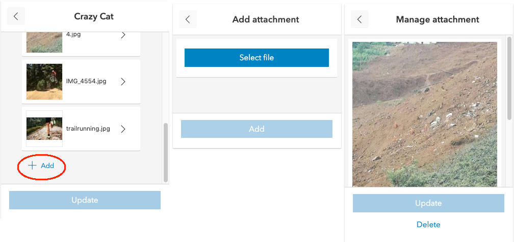
- See also:
Constructors
- new Attachments(properties)
- Parameter:properties Objectoptional
See the properties for a list of all the properties that may be passed into the constructor.
Property Overview
| Name | Type | Summary | Class | |
|---|---|---|---|---|
| String|HTMLElement | The ID or node representing the DOM element containing the widget. more details | more details | Widget | |
| String | The name of the class. more details | more details | Accessor | |
| String | A string value indicating how to display the attachment. more details | more details | Attachments | |
| Graphic | The graphic for the attachments. more details | more details | Attachments | |
| String | The unique ID assigned to the widget when the widget is created. more details | more details | Widget | |
| String | The widget's label. more details | more details | Widget | |
| AttachmentsViewModel | The view model for this widget. more details | more details | Attachments |
Property Details
The ID or node representing the DOM element containing the widget. This property can only be set once. The following examples are all valid use cases when working with widgets.
Examples:// Create the HTML div element programmatically at runtime and set to the widget's container const basemapGallery = new BasemapGallery({ view: view, container: document.createElement("div") }); // Add the widget to the top-right corner of the view view.ui.add(basemapGallery, { position: "top-right" });// Specify an already-defined HTML div element in the widget's container const basemapGallery = new BasemapGallery({ view: view, container: basemapGalleryDiv }); // Add the widget to the top-right corner of the view view.ui.add(basemapGallery, { position: "top-right" }); // HTML markup <body> <div id="viewDiv"></div> <div id="basemapGalleryDiv"></div> </body>// Specify the widget while adding to the view's UI const basemapGallery = new BasemapGallery({ view: view }); // Add the widget to the top-right corner of the view view.ui.add(basemapGallery, { position: "top-right" });
The name of the class. The declared class name is formatted as
esri.folder.className.
- displayType String
A string value indicating how to display the attachment.
If
listis specified, attachments show as links. Ifpreviewis specified, a thumbnail of each attachment will be shown.Possible Values:"preview"|"list"
- Default Value:"list"
- graphic Graphic
The graphic for the attachments.
The unique ID assigned to the widget when the widget is created. If not set by the developer, it will default to the container ID, or if that is not present then it will be automatically generated.
The widget's label.
This property is useful whenever the widget is controlled by another one (e.g. Expand)
- viewModel AttachmentsViewModelautocast
The view model for this widget. This is a class that contains all the logic (properties and methods) that controls this widget's behavior. See the AttachmentsViewModel class to access all properties and methods on the widget.
Method Overview
| Name | Return Type | Summary | Class | |
|---|---|---|---|---|
| String | A utility method used for building the value for a widget's | more details | Widget | |
Destroys the widget instance. more details | more details | Widget | ||
| Boolean | Emits an event on the instance. more details | more details | Widget | |
| Boolean | Indicates whether there is an event listener on the instance that matches the provided event name. more details | more details | Widget | |
| Object | Registers an event handler on the instance. more details | more details | Widget | |
Widget teardown helper. more details | more details | Widget | ||
This method is primarily used by developers when implementing custom widgets. more details | more details | Widget | ||
| Object | This method is primarily used by developers when implementing custom widgets. more details | more details | Widget | |
Renders widget to the DOM immediately. more details | more details | Widget | ||
This method is primarily used by developers when implementing custom widgets. more details | more details | Widget |
Method Details
A utility method used for building the value for a widget's
classproperty. This aids in simplifying CSS class setup.Parameter:repeatable The class names.
Returns:Type Description String The computed class name. Example:// .tsx syntax showing how to set CSS classes while rendering the widget render() { const dynamicIconClasses = { [CSS.myIcon]: this.showIcon, [CSS.greyIcon]: !this.showIcon }; return ( <div class={classes(CSS.root, CSS.mixin, dynamicIconClasses)} /> ); }
- destroy()inherited
Destroys the widget instance.
Emits an event on the instance. This method should only be used when creating subclasses of this class.
Parameters:type StringThe name of the event.
event ObjectoptionalThe event payload.
Returns:Type Description Boolean trueif a listener was notified
Indicates whether there is an event listener on the instance that matches the provided event name.
Parameter:type StringThe name of the event.
Returns:Type Description Boolean Returns true if the class supports the input event.
Registers an event handler on the instance. Call this method to hook an event with a listener.
Parameters:A event type, or an array of event types, to listen for.
listener FunctionThe function to call when the event is fired.
Returns:Type Description Object Returns an event handler with a remove()method that can be called to stop listening for the event(s).Property Type Description remove Function When called, removes the listener from the event. Example:view.on("click", function(event){ // event is the event handle returned after the event fires. console.log(event.mapPoint); });
- own(handles)inherited
Widget teardown helper. Any handles added to it will be automatically removed when the widget is destroyed.
Parameter:handles WatchHandle|WatchHandle[]Handles marked for removal once the widget is destroyed.
- postInitialize()inherited
This method is primarily used by developers when implementing custom widgets. Executes after widget is ready for rendering.
This method is primarily used by developers when implementing custom widgets. It must be implemented by subclasses for rendering.
Returns:Type Description Object The rendered virtual node.
- renderNow()inherited
Renders widget to the DOM immediately.
- scheduleRender()inherited
This method is primarily used by developers when implementing custom widgets. Schedules widget rendering. This method is useful for changes affecting the UI.