ButtonMenuItem
require(["esri/widgets/FeatureTable/Grid/support/ButtonMenuItem"], function(ButtonMenuItem) { /* code goes here */ });esri/widgets/FeatureTable/Grid/support/ButtonMenuItemThe ButtonMenuItem class provides the underlying menu functionality to create and customize new menu items within the FeatureTable widget's ButtonMenu.
Known Limitations Dark themed CSS is currently not supported.
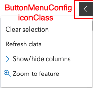
The following image displays two custom ButtonMenuItems added to the FeatureTable widget's ButtonMenu.
- See also:
Constructors
- new ButtonMenuItem(properties)
- Parameter:properties Objectoptional
See the properties for a list of all the properties that may be passed into the constructor.
Example:// Typical usage for ButtonMenuItem const buttonMenuItem1 = new ButtonMenuItem ({ label: "custom menu item label", iconClass: "Icon font name, if applicable", clickFunction: function () { // Add custom function to perform on menu item button click } }); const buttonMenuItem2 = new ButtonMenuItem ({ label: "Second custom menu item label", iconClass: "Second icon font name, if applicable", clickFunction: function (event) { // Add second custom function to perform on menu item button click } }); // Apply the button menu items above to the button menu const buttonMenu = new ButtonMenu ({ iconClass: "esri-icon-left", items: [buttonMenuItem1, buttonMenuItem2] });
Property Overview
| Name | Type | Summary | Class | |
|---|---|---|---|---|
| Boolean | Indicates whether to automatically close the menu's item. more details | more details | ButtonMenuItem | |
| ButtonMenuItemClickFunction | A function that executes on the ButtonMenuItem's | more details | ButtonMenuItem | |
| String | The name of the class. more details | more details | Accessor | |
| String | Adds a CSS class to the menu button's DOM node. more details | more details | ButtonMenuItem | |
| ButtonMenuItem[] | An array of individual menu items. more details | more details | ButtonMenuItem | |
| String | The label of the menu item. more details | more details | ButtonMenuItem | |
| Boolean | Indicates if the menu content is visible. more details | more details | ButtonMenuItem | |
| Boolean | Indicates whether the menu item is selected. more details | more details | ButtonMenuItem | |
| Boolean | Indicates whether a toggled state should be applied to individual menu items. more details | more details | ButtonMenuItem |
Property Details
- autoCloseMenu Boolean
Indicates whether to automatically close the menu's item.
- Default Value:false
- clickFunction ButtonMenuItemClickFunction
A function that executes on the ButtonMenuItem's
clickevent. If applicable, it provides the developer with access to the inputButtonMenuItemand its properties.
The name of the class. The declared class name is formatted as
esri.folder.className.
- iconClass String
Adds a CSS class to the menu button's DOM node.
- See also:
- items ButtonMenuItem[]autocast
An array of individual menu items.
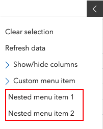
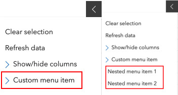
The following image shows a custom menu item with two nested menu items within it.
 Example:
// Button menu items are autocastable in the ButtonMenu
items: [{
  label: "Custom menu item",
  iconClass: "esri-icon-right",
  items: [{
    label: "Nested menu item 1",
    clickFunction: function(event) {
      // click function for first nested menu item
    },
  }, {
    label: "Nested menu item 2",
    clickFunction: function(event) {
      // click function for second nested menu item
    },
  }],
  clickFunction: function(event) {
  // click function on parent menu item
  }
}]
- label String
The label of the menu item. This can be used in conjunction with the iconClass property.
- open Boolean
Indicates if the menu content is visible.
- Default Value:false
- selected Boolean
Indicates whether the menu item is selected. This is useful in use-cases when needing to apply a toggled state to individual menu items. An example of this can be seen in the default menu's
Show/hide columnsbutton. Use this in combination when selectionEnabled istrue.- Default Value:false
- See also:
- selectionEnabled Boolean
Indicates whether a toggled state should be applied to individual menu items. An example of this can be seen with the invididual items nested under the default menu's
Show/hide columns. Use this in combination with the selected property.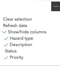
- Default Value:false
- See also:
Type Definitions
- ButtonMenuItemClickFunction(event)
Function definition for the clickFunction property.
Parameters:event ObjectAn object containing the clicked
ButtonMenuItem.Specification:item ButtonMenuItemA reference to the clicked
ButtonMenuItem.